Overview
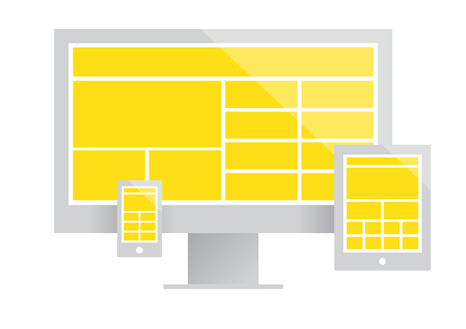
Nowadays, it is all too obvious that the need for websites to function efficiently and look great on an ever-expanding variety of devices, screen dimensions, and resolutions is paramount to that website’s overall success and reputation. Responsive and adaptive web design are two similar yet fundamentally different methods of accomplishing this task. The target goal of both approaches is to take the content and design elements of a website and rearrange them in size, shape, order and/or proportion to fit a variety of screen widths. Simply put, this allows for a more efficient, intuitive experience for the user regardless of the device they are using. Responsive and adaptive design each have their merits and disadvantages and, depending on the requirements of the site your are building, one might be a more appropriate solution over the the other. The thing I think is most important when considering which approach is best, is to evaluate which will future-proof your site, allowing it to look great and function well for a longer period of time regardless of what new devices enter the market. Accomplishing this mission means less time spent revisiting and altering the design which, subsequently, means less money clients have to spend. This affords a pleasant end-result for all. I will do my best to highlight the benefits and pitfalls of each approach so that making the choice between the two methods will be an easier one.
Responsive Web Design
Ethan Marcotte is responsible for coining the term “Responsive Design” and defining its practice in his 2010 article, “Responsive Web Design”. The principles of this method are based around a sole idea that everything must be fluid. The layout should be percentage-based, the media should be flexible, and the grid should be fluid, all to deliver a seamlessly transitioned experience between any pixel-based screen width. The first step in accomplishing this effect is to build the layout columns in percentages that should rearrange and drop below one another as screen width changes. This will display the content in chunks that enable easy readability. Use relative units of measure, such as em’s or rem’s for your text sizes instead of pixels. Set your images’ width to 100%, height to ‘auto’, and give them a max-width that they’re size shouldn’t exceed. This will make the images scale smoothly through layout changes. Adjusting the dimensions of video content is more difficult in responsive layout design, but using javascript methods and plugins, such as fitvids, can solve this problem in some environments and browsers. The benefit of responsive design is that it is device and breakpoint independent, requiring less post-project maintenance. The setback is that responsive websites can potentially take longer to develop and are tough, if not impossible, to test on every single real device simply because most developers don’t have access to all of them.
Adaptive Web Design
In 2011, Aaron Gustafson defined and expounded on the term “Adaptive Web Design” in his book by the same title. The main concepts of adaptive layout design revolve around a user-focused, predefined set of layout sizes that adapt to detected devices while utilizing the principle of Progressive Enhancement. Basically, this means that the designer/developer chooses a few specific, pixel-based, fixed widths as their breakpoints to design content around. They apply styles to, as well as eliminate, elements on the page progressively throughout the breakpoints to display only whats necessary at each width. While CSS3 media queries can be used in both responsive and adaptive methods of development, in adaptive design they are the tool with which the fixed breakpoint sizes and progressive enhancement are expressed. An example of these elements working together is shown below:
Here you can see adaptive design’s principles at work: The container div is being set to a fixed, pixel-based width for each screen size declaration and progressive enhancement is utilized by hiding the image-slider on the iphone view. If this were responsive design, the container’s width would be something like 98% regardless of the breakpoints. The benefit of the adaptive design approach is that it can be easier and more predictable to develop because it allows for the dictation of elements’ size and position at specific screen width declarations. This gives the designer and developer more control over the presentation of the content. Another benefit is that, with progressive enhancement, users will get a more concentrated version of the website they are viewing at smaller screen widths so that they won’t have to sift through unnecessary content and design elements in order to get to the the core information they looking for. Also, websites designed and developed with the adaptive approach are easier to test given that they are designed around a few set, pre-defined screen widths. The downfall to adaptive design is that it is not as future-proof as responsive design because it does not plan for devices that are not yet created. This could require additional editing and designing in the future.
Conclusion
Overall, I think both responsive and adaptive design approaches have their own place in creating better user experiences on multiple devices. One just has to determine which method best accomplishes this task for their own unique website or application. For instance, it makes no sense to spend the time making each element fluid or percentage-based when you are creating an application made uniquely for the ipad. However, it might be a better idea to implement responsive design techniques for a marketable, business website who’s goal is to be seen by as many people as possible which means it must be device-independant. Personally, I think there’s no reason why you can’t utilize a mixture of techniques to create a great user experience. In fact, I find my self often structuring a website on a fluid, percentage-based layout while implementing progressive enhancement to display only what’s necessary for viewership on small screens. Either way, when the right approach for a website or application is used, the viewer will have a more positive experience of your work, which is, in the end, the most important outcome.