The Challenge
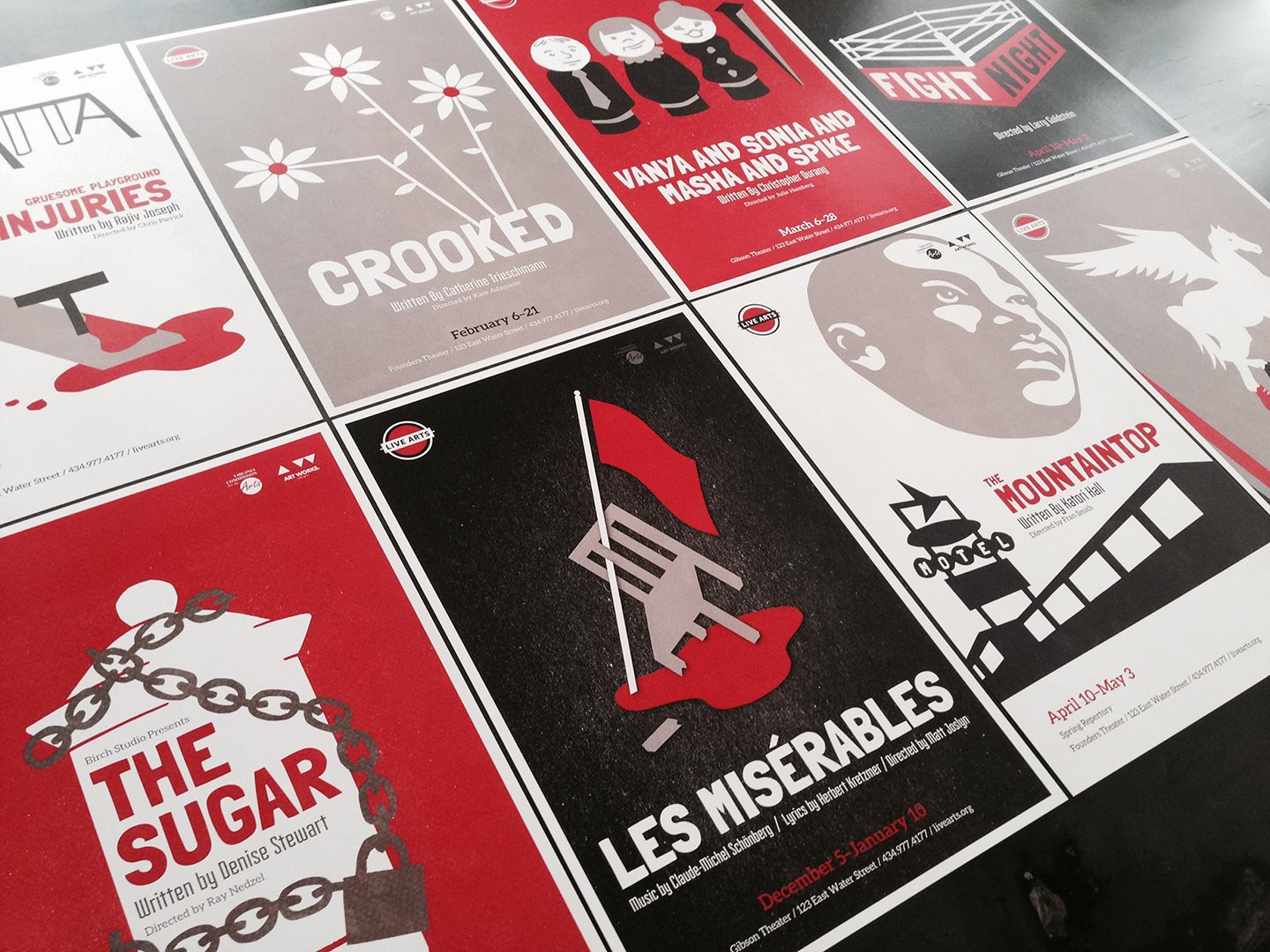
In 2014, Charlottesville’s beloved downtown community theater, Live Arts, debuted a cohesive season look for the first time. Convoy designed a style that could be leveraged on everything from an 80s mega-musical epic about 19th century France to a suburban adolescent drama. The twenty-fourth season’s hand-cut paper illustrations and simple white-black-red color scheme were versatile and eye-catching, and our goal this year was to develop another season style just as distinct and flexible as the last.
2015-2016 is a big year for Live Arts. The theater first opened its doors in 1990, and is now celebrating its silver anniversary, looking fondly back on the last quarter century and planning for the years to come. When we set about designing the season style, we had a few things in mind:
- We wanted it to be very different from last year’s, while still maintaining a cohesive look.
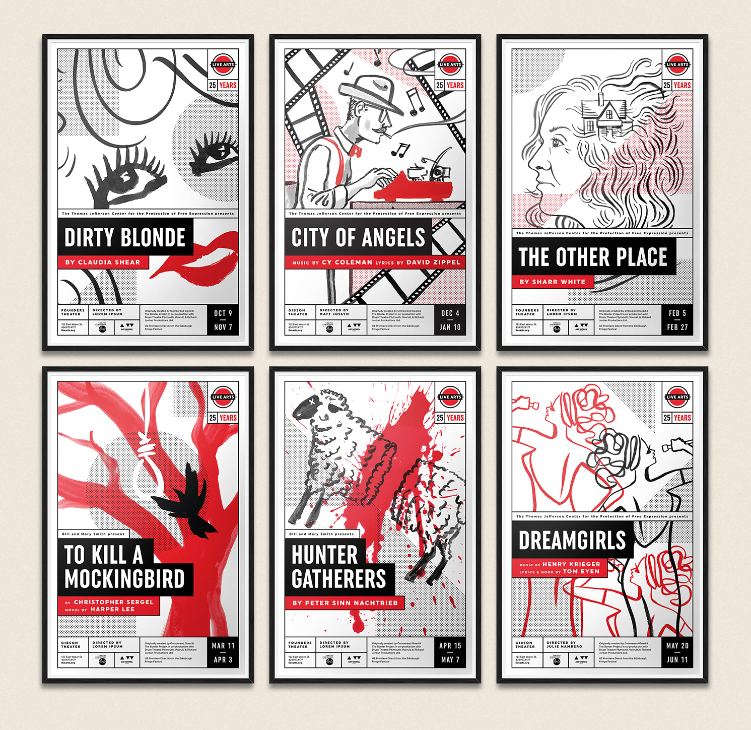
- Versatility was key. After all, the twenty-fifth anniversary season will be just as far-ranging as the twenty-fourth: we’re talking Mae West, film noir, animal sacrifice, Alzheimer’s, Atticus Finch, and the Dreamettes all sharing one season.
- This year’s season brochure would be twice its usual size, packing in retrospective content from the past twenty-five years alongside new show artwork and programming info. We wanted something that could be contemporary and a little retro at the same time.
Getting Started
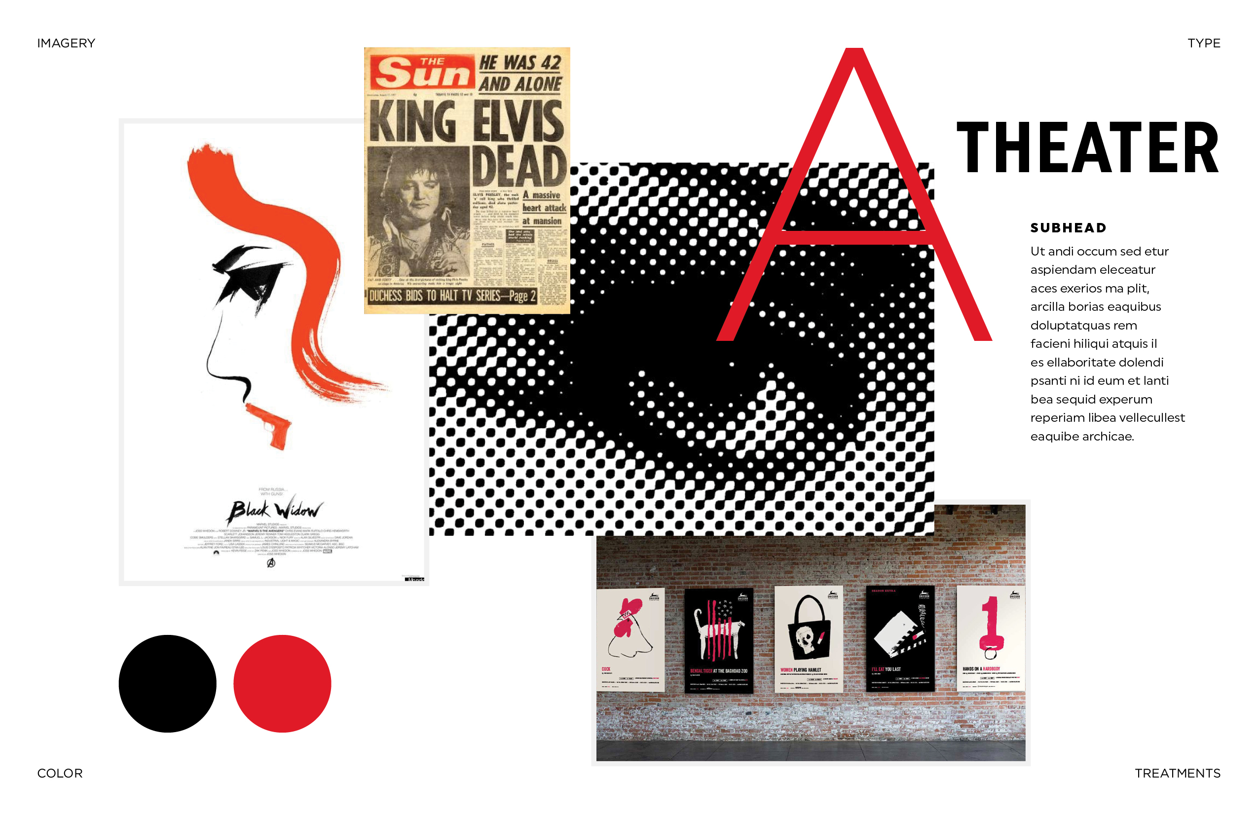
Most big design projects begin with a mood board. In the days of Mad Men, mood boards were physical media: bulletin boards or walls covered in clippings and sketches that can relate to the project at hand. Some agencies still go old school, but today at Convoy, we mostly use Pinterest.
We began by browsing sites like Designspiration, Niice, and Behance. At the same time, Live Arts pulled together some things they liked. When we compared notes, we stumbled onto a happy coincidence: after a year of paper cut-outs, we were all now thinking more along the lines of paint.
Making Space
One of the tricky things about theatrical poster design is how much information needs to fit. Title, playwright, director, assistant director, date, time, theater address… and, depending on the play in question, you may also need to include details about the show’s original premiere, the awards it’s won, the person who wrote the book, the person who wrote the lyrics, the original directors, the original choreographers, the first production company, and probably everyone’s favorite color, too. It’s a lot to juggle. And the restrictions don’t end with who has to appear on the poster, but also how they’re presented. There are rules about the size of the playwright’s name relative to the director’s name, etc., etc.
This year, we wanted to make sure there was a place for everything and that everything was in its place. To balance the free-flowing brush stroke artwork, we developed a blocky, modular poster style. For the season’s type, we chose Uniform, a large font family with three styles and a dozen weights of each, easily readable across sizes, that would give us enough wiggle room to style all of the necessary poster text without feeling cluttered. For a bit of a retro flare, we threw in some Lichtenstein-inspired dots that we could deploy as necessary to for visual balance or to highlight particular aspects of the artwork (check out To Kill a Mockingbird below, for instance).
Last but certainly not least, we needed a special twenty-fifth season version of the Live Arts logo–still recognizable at a glance, but calling attention to the anniversary. Our modular style and the chosen font family fit the bill.
To pitch the direction, we designed two initial posters so that Live Arts could see how these floating pieces would come together in a whole season. With their approval, we started building out all of the season materials: brochures, t-shirts, magnets, postcards, and more.
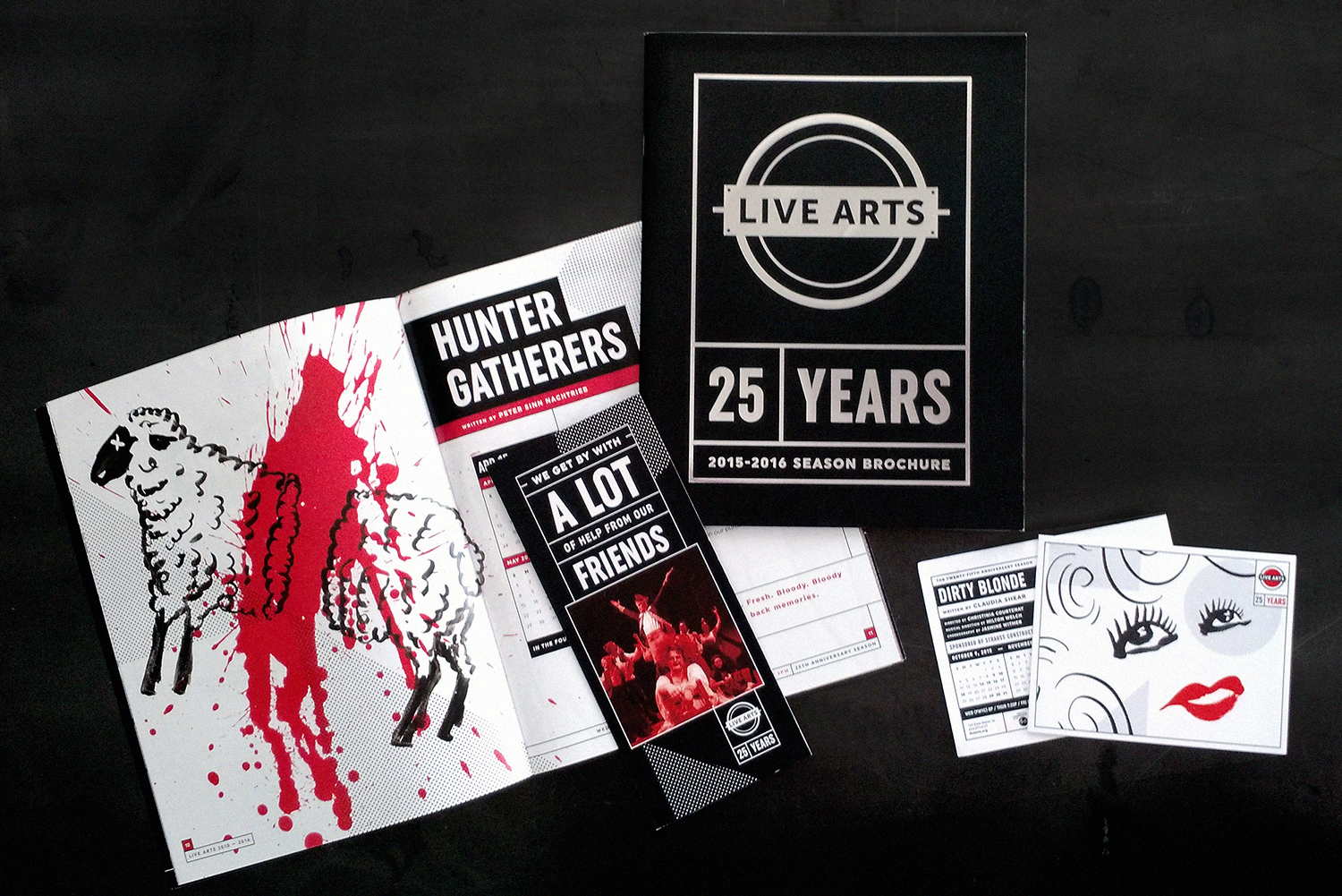
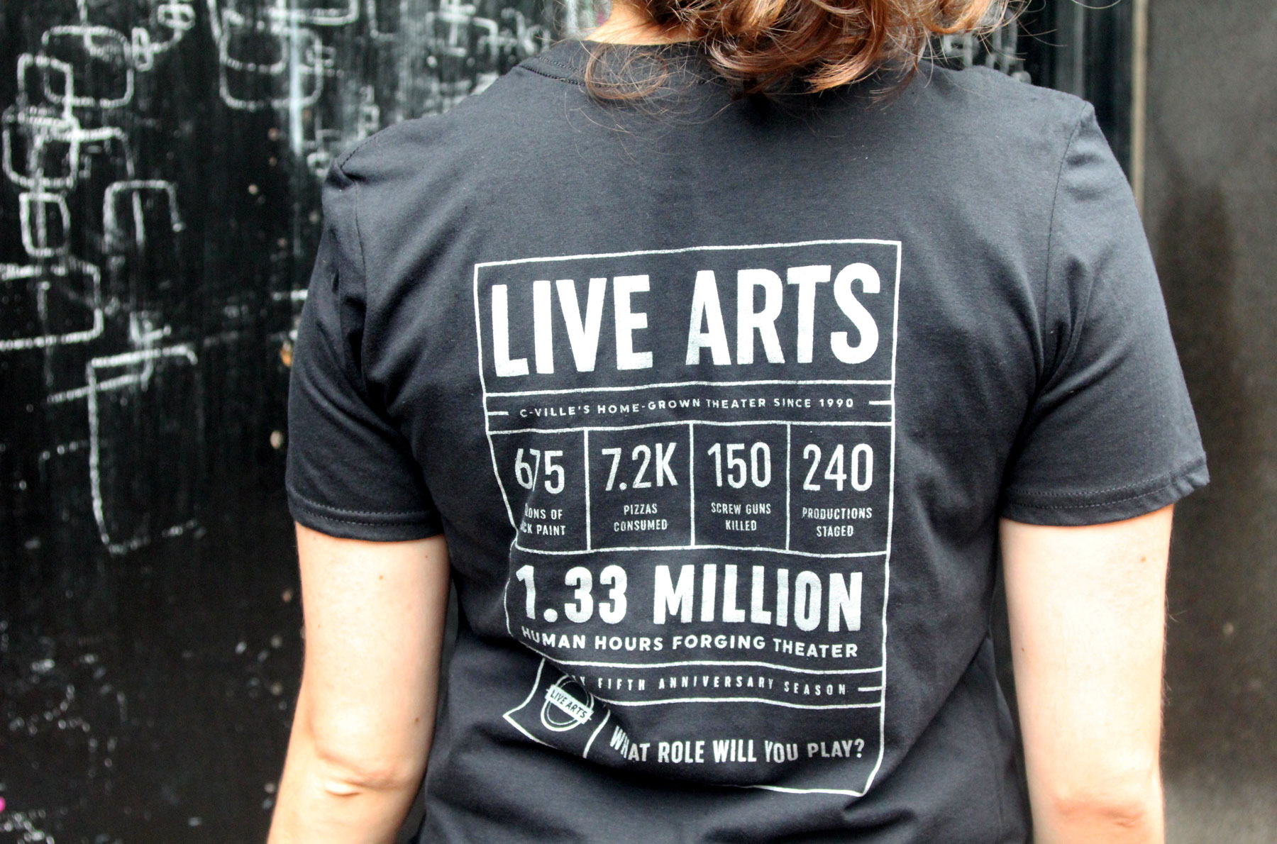
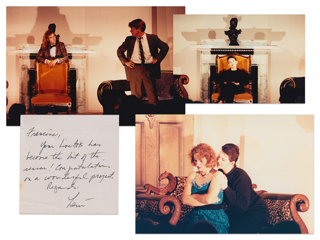
From start to finish, the whole process took about a month, and included some fun extras to our usual workflow: for a few days, you could wander into the Convoy conference room and find art director Matt Thomas splashing red paint blood spatters for Hunter Gatherers, or painting Mae West eyes over and over again to get her lashes just right for Dirty Blonde. I took a trip to the Live Arts office to dig through their archives–a row of banker’s boxes full of photos, old programs, posters, newspaper clippings, and letters from fans–and pulled a few dozen pieces to incorporate into the retrospective brochure spreads.
Break a Leg
Now that our part of the process is done, we’re excited to see how Live Arts brings all of these shows to life in the coming season. Dirty Blonde is on stage now through November 7, and is already blowing audiences away with its sassy, bawdy charm. Be sure to check out the full schedule and consider a season subscription package–it’s going to be a great year!