Typefaces are in abundance these days. The modern designer faces thousands of font choices when working on a project, and the selection can be daunting. While some embrace the glut of PostScript mania, purists take a more streamlined approach (like the late Massimo Vignelli, who restricted himself and his designers to a half-dozen typefaces). There are strong arguments on either side of this debate. At Convoy, we’ve devised an approach to typography that lies somewhere in the middle. We call it our font capsule.
The idea sprung from a lunchtime conversation over Thai about capsule wardrobes. The term capsule wardrobe was coined by Susie Faux, the owner of a London boutique called “Wardrobe” in the 1970s. According to Faux, a capsule wardrobe is a collection of essential items that don’t go out of fashion. By limiting yourself to signature pieces—items that are coherent, versatile, and you feel confident in—the benefits are multifold: confidence, less waste, and efficiency.
We realized we could apply this approach to type selection, a large part of our day-to-day. Here are the guidelines we followed.
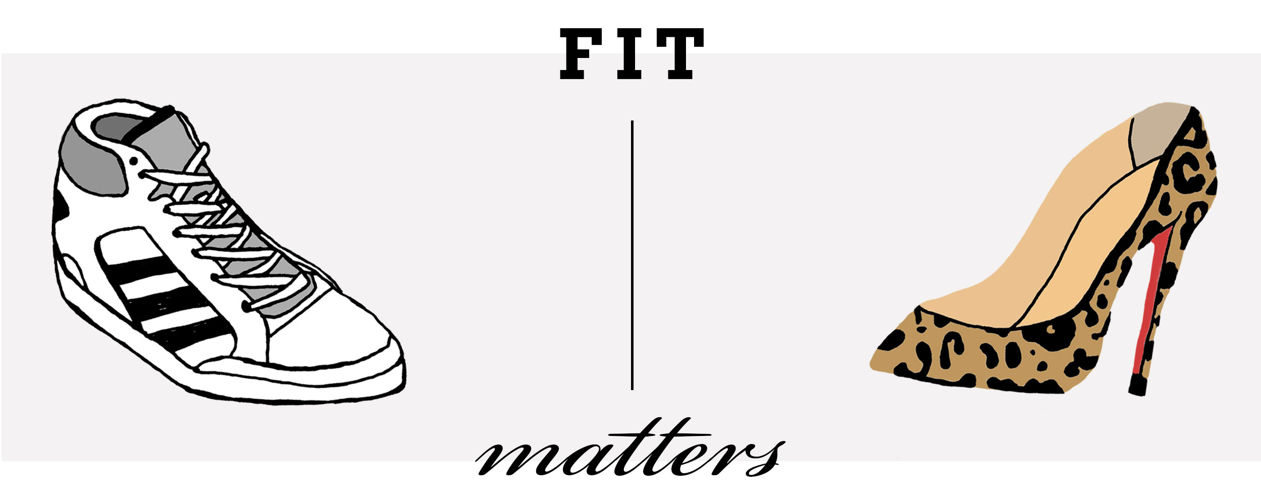
Like choosing clothes that flatter your body shape and personal style, a font may or may not fit your company’s clientele. Consider the fonts used in editorial design vs. wedding stationery. These specializations have different target audiences, yielding different results. Your choices should reflect that.
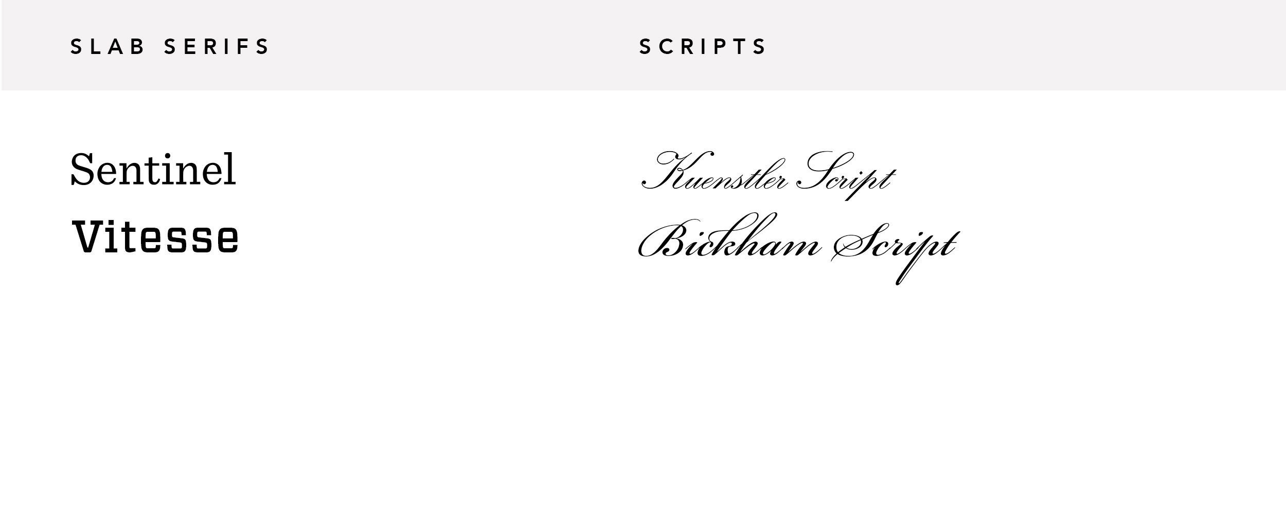
Fonts: Vitesse, Bickham Script
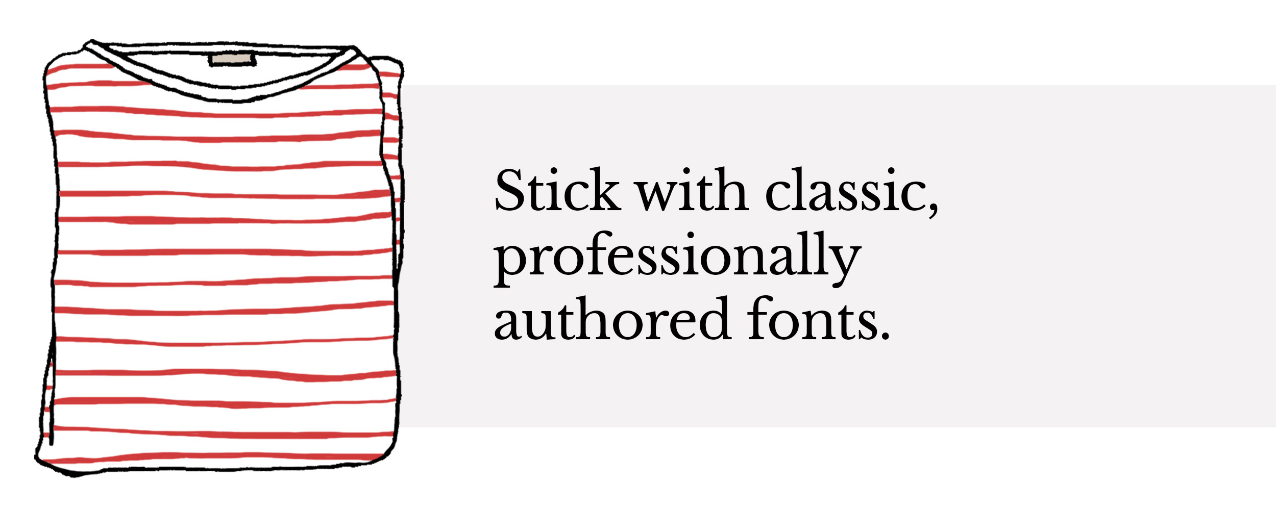
Like a striped t-shirt or a timeless trench, some typefaces stand the test of time. When you purchase a high-quality, staple font, your return includes multiple weights, a vast glyph selection, and thoughtful details like ligatures (the fine tailoring of type). Invest now, thank yourself later.
Font: Libre Baskerville
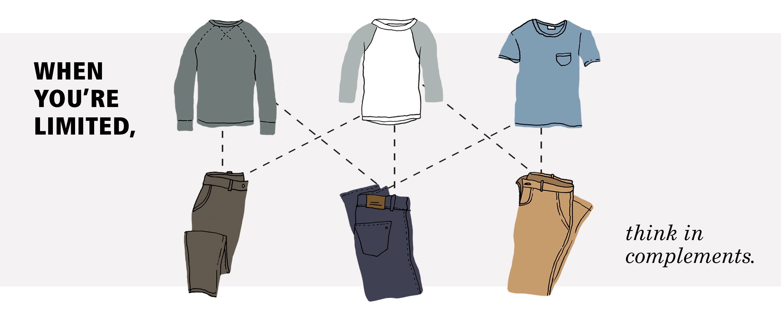
To achieve an illusion of quantity, proponents of capsule wardrobes suggest sticking to a color palette. Mix and match items and textures within that palette (denim with silk, tweed with cotton) to stretch your closet further. Remember grade school math? “Billy has five shirts and four pairs of pants. How many outfits does he have?” The answer is twenty. Twenty possible outfits! Like clothing, designers can stretch their capsules further through thoughtful combinations. Contrast and hierarchy are your friends.
Fonts: Frutiger, New Century Schoolbook
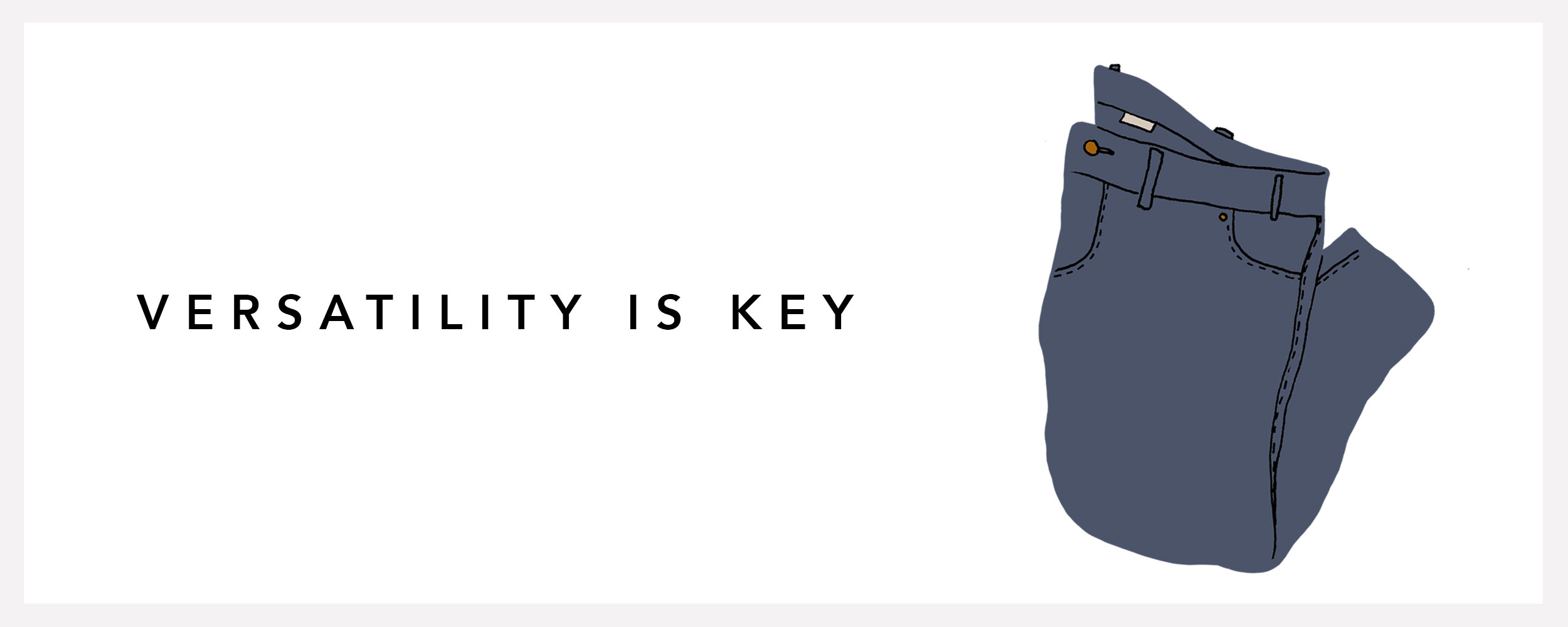
Capsule wardrobes have as few as forty items. Buying the same pair of chinos in five colors would take up a lot of real estate. On the other hand, jeans can be dressed up, dressed down, and worn three days a week. Invest in a font as versatile as your favorite pair of dark wash denim.
Font: Avenir
When your wardrobe is limited, shoes and accessories become an outlet for expression and trends. And with a foundation of basics, flashy baubles and fresh boots go a long way. Display fonts feel much the same, a worthwhile splurge for a special occasion or a few seasons of use. And that’s okay. Allow a budget for these purchases and remember, all things in moderation.
Fonts: ITC Grouch, Brandon Grotesque
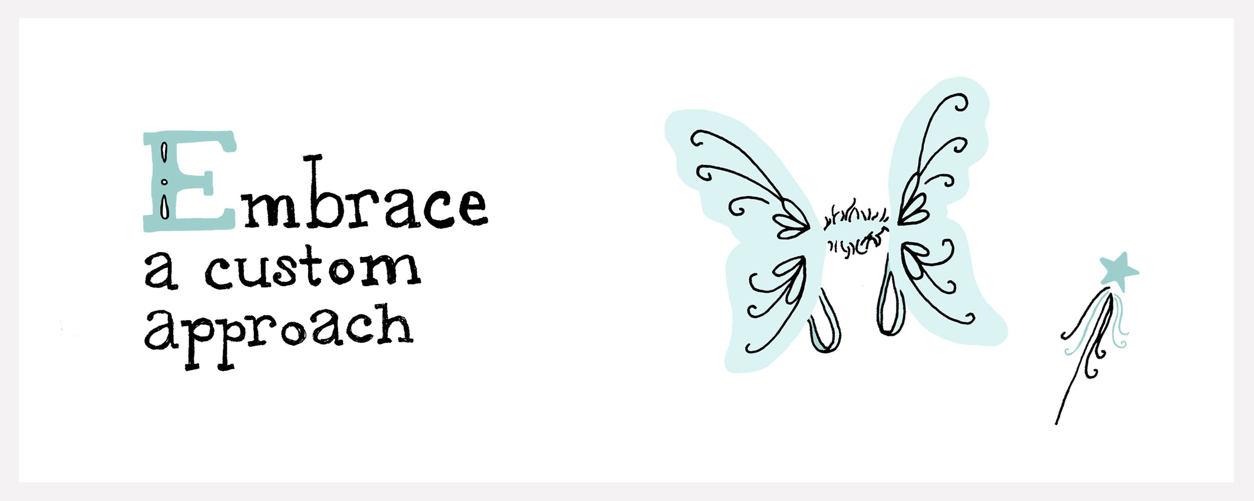
Imagine Halloween is around the corner. For most people, this means buying a costume and wearing it once. A more sustainable approach is a custom one, and a well-established capsule makes a great starting point. Like adding homemade wings to a dress you already own, try customizing a standard font with some fancy bezier work. For a totally custom approach, hand-letter. A capsule is limiting, but creativity is not.
While defining our capsule, these resources came in handy:
TypeWolf, a site that showcases “fonts in use” and font pairing suggestions
WhatFont, a Chrome plug-in that quickly inspect fonts found online
MyFonts, a massive font archive used to search, compare, and test fonts
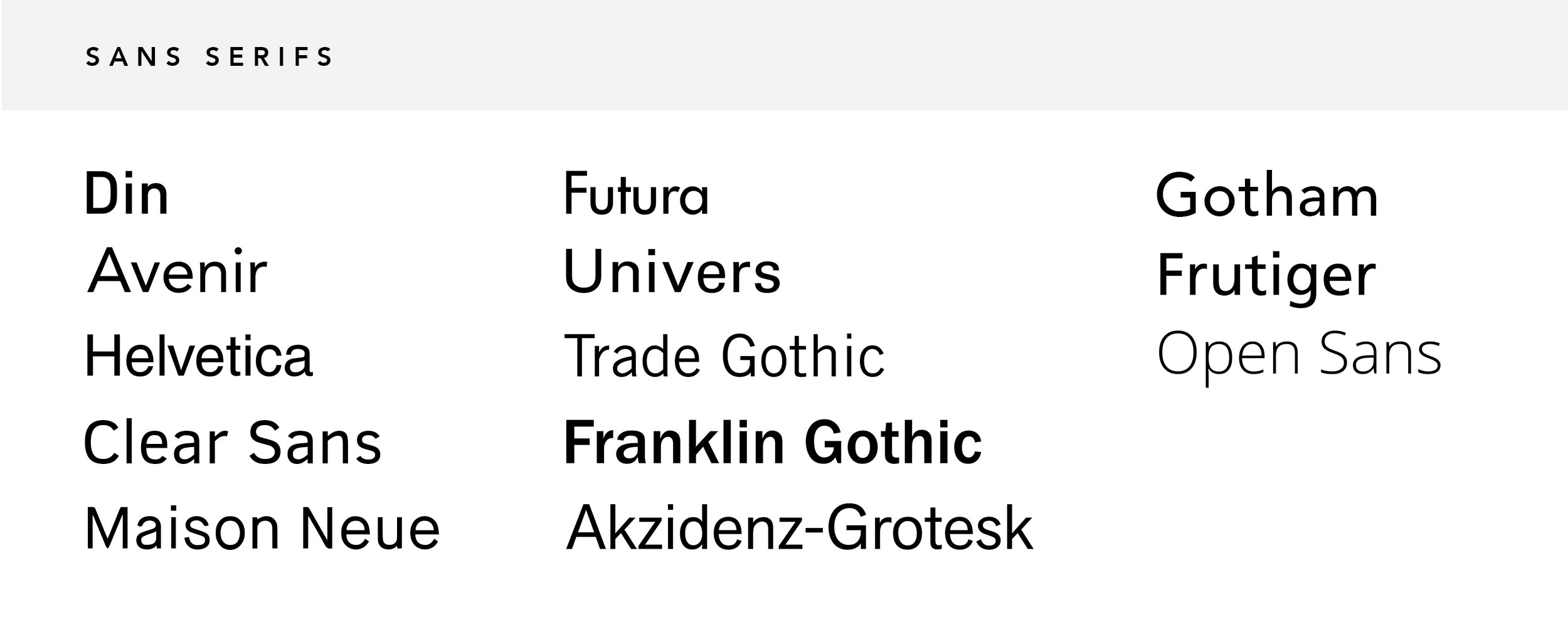
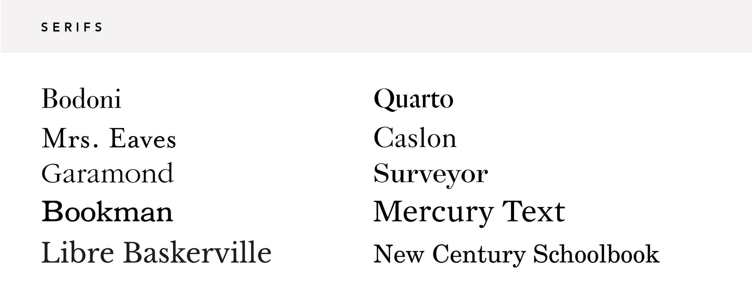
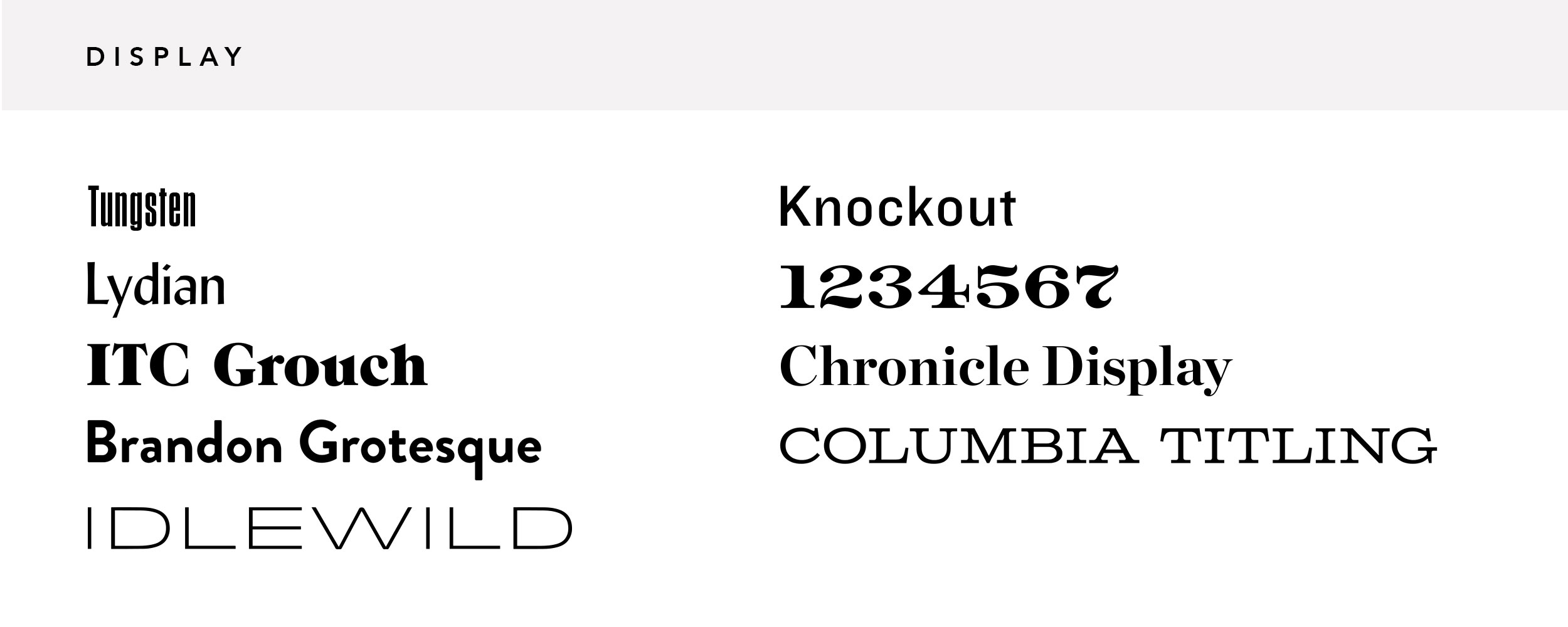
The most challenging part of this process was nailing down our favorite fonts. A standard capsule wardrobe features 39 items, divided proportionately by how much use those items get. A common guideline is 15 tops, 9 bottoms, 9 pairs of shoes, 2 dresses, and 2 coats. We kept a similar break down, dividing our type between 13 sans serifs, 11 serifs, 9 display fonts, 2 slab serifs, and 2 scripts. Check out our final selection (and links to their foundries) below.
Din | Avenir | Helvetica | Clear Sans | Maison Neue | Futura | Univers | Trade Gothic | Franklin Gothic | Akzidenz-Grotesk | Gotham | Frutiger | Open Sans | Bodoni | Mrs. Eaves | Garamond | Bookman | Libre Baskerville | Quarto | Caslon | Surveyor | Mercury Text | New Century Schoolbook | Tungsten | Lydian | ITC Grouch | Brandon Grotesque | Idlewild | Knockout | Numbers | Chronicle Display | Columbia Titling | Sentinel | Vitesse | Kuenstler Script | Bickham Script


